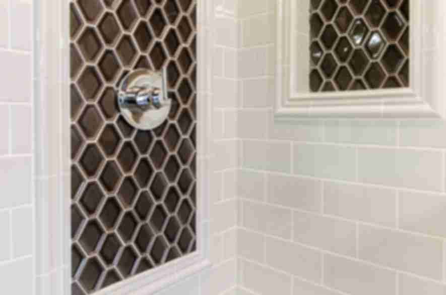
Choosing the Perfect Accent Tile: Color and Material Considerations
When I set out to revamp my bathroom, one of the most exciting aspects was choosing the perfect accent tiles. Accent tiles can transform a space by adding color, texture, and visual interest. Here are some key considerations that helped me select the ideal accent tiles for my bathroom.
- Color Harmony: The first step was considering the color scheme of my bathroom. I wanted the accent tiles to complement the existing colors without overpowering them. I chose a subtle yet striking blue that contrasted beautifully with the white and gray tones of my bathroom. This pop of color brought a fresh, serene vibe to the space.
- Material Matters: Selecting the right material was crucial. I had options like ceramic, glass, stone, and porcelain. I opted for glass tiles because of their reflective quality and sleek appearance. Glass tiles added a touch of sophistication and made the bathroom feel brighter and more spacious.
- Texture and Finish: The texture and finish of the tiles also played a significant role. Glossy finishes create a polished, modern look, while matte finishes offer a more understated elegance. I chose a mix of both, using glossy tiles for the accent wall behind the vanity and matte tiles for the shower niche. This combination added depth and visual interest.
- Size and Scale: The size of the accent tiles was another important consideration. Larger tiles can make a bold statement, while smaller tiles can create intricate patterns. I decided on small, mosaic-style tiles for the shower floor to add a unique touch without overwhelming the space. The smaller scale worked well in the compact area.
- Placement: Deciding where to place the accent tiles was key to achieving the desired effect. I used them to highlight specific areas, such as the backsplash behind the sink and the niche in the shower. This strategic placement ensured the accent tiles stood out as focal points without being too busy.
- Budget-Friendly Options: Lastly, I considered my budget. Accent tiles can vary widely in price, so finding beautiful yet affordable options was important. I shopped around and found some stunning glass tiles on sale, allowing me to achieve a high-end look without breaking the bank.

Statement Walls: Creating a Focal Point with Tile Accents
Creating a statement wall with tile accents was a game-changer in my bathroom remodel. This design choice allowed me to infuse personality and style into the space. Here’s how I went about creating a stunning focal point with tile accents.
Selecting the Wall The first step was choosing the right wall to highlight. I decided on the wall behind the vanity because it’s one of the first things you see when entering the bathroom. This wall provided a perfect canvas for a dramatic transformation.
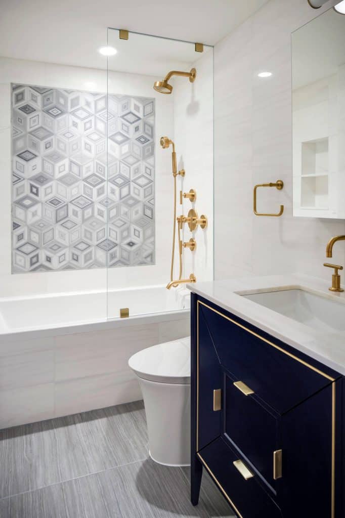
Bold Tile Choices For a true statement, I opted for bold, eye-catching tiles. I chose a rich, deep blue with a slightly metallic finish that added a luxurious touch. The color contrasted beautifully with the neutral tones of the other walls, making the statement wall the star of the show.
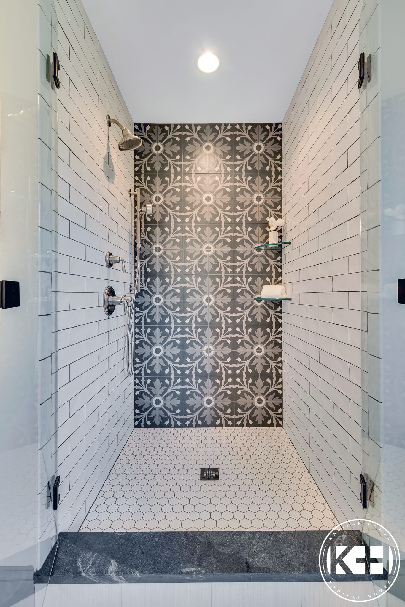
Pattern Play To enhance the visual impact, I incorporated an intricate pattern. The tiles featured a geometric design that added a modern, artistic flair. This pattern drew the eye and added a layer of complexity to the design, making the wall even more captivating.
Balancing the Space While the statement wall was the focal point, it was essential to balance it with the rest of the bathroom. I kept the other elements, like the flooring and fixtures, more subdued. This approach ensured the wall stood out without clashing with the overall decor.
Lighting Matters Proper lighting was crucial to highlight the statement wall. I installed LED strip lights along the top edge, which created a soft, ambient glow that enhanced the tile’s metallic sheen. This lighting choice made the wall look even more spectacular, especially in the evening.
Finishing Touches To complete the look, I added a few decorative elements that complemented the statement wall. A large, frameless mirror reflected the beautiful tiles, making the space feel larger. I also incorporated matching blue accessories, like towels and a soap dispenser, to tie the design together.
Border and Trim Tiles: Adding Subtle Elegance
Adding border and trim tiles was a subtle yet effective way to elevate my bathroom’s design. These small touches brought a sense of sophistication and completeness to the space. Here’s how I used border and trim tiles to enhance my bathroom.
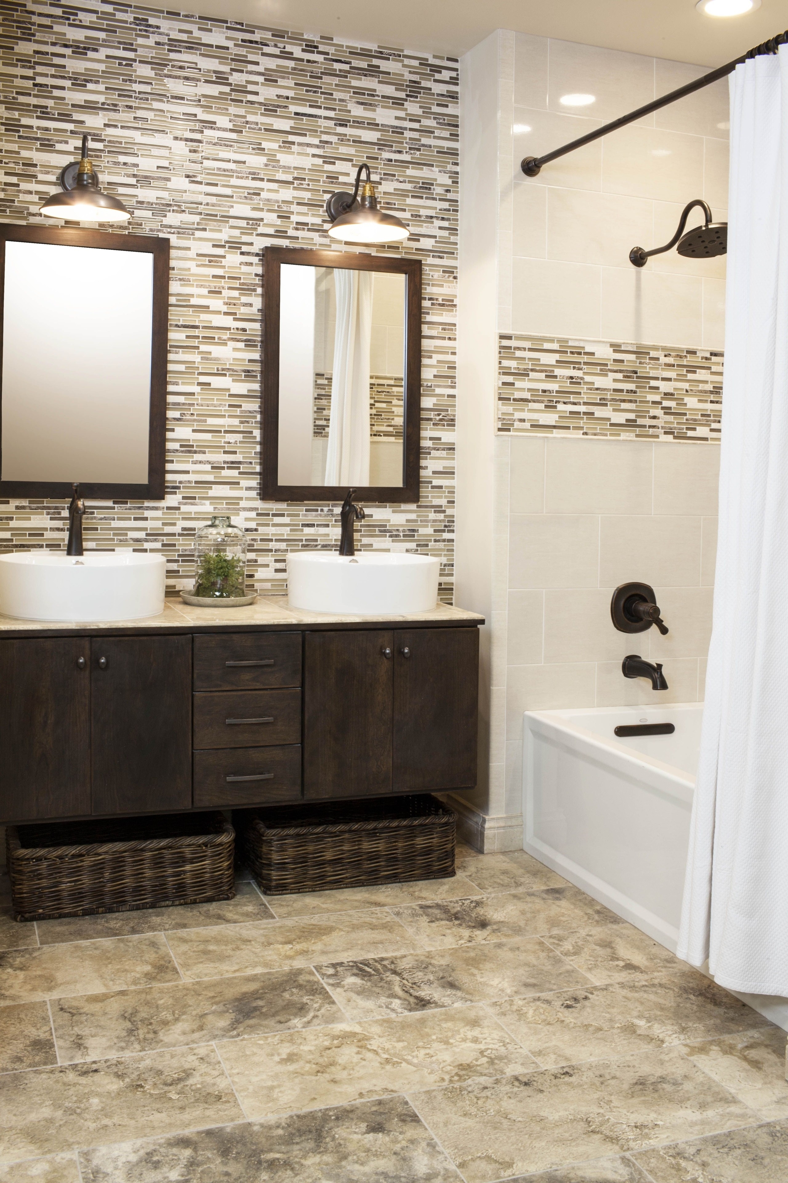
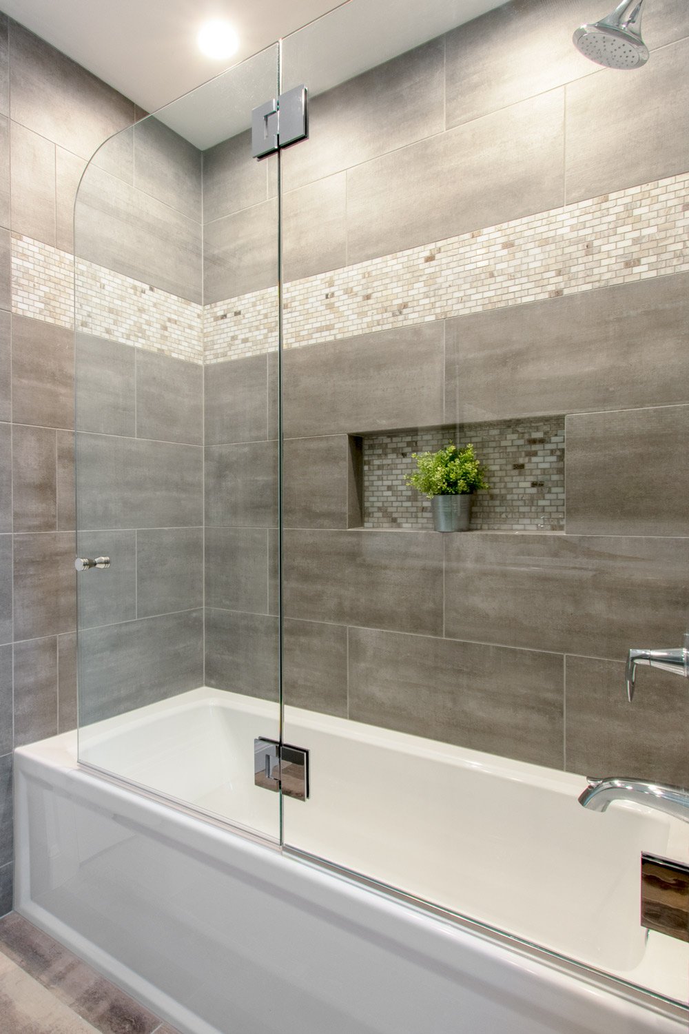
Choosing the Right Tiles I started by selecting tiles that complemented my main wall and floor tiles. I opted for a sleek, metallic trim tile that matched the fixtures and added a touch of elegance. For the border, I chose a mosaic tile with a blend of neutral tones that tied the whole room together.
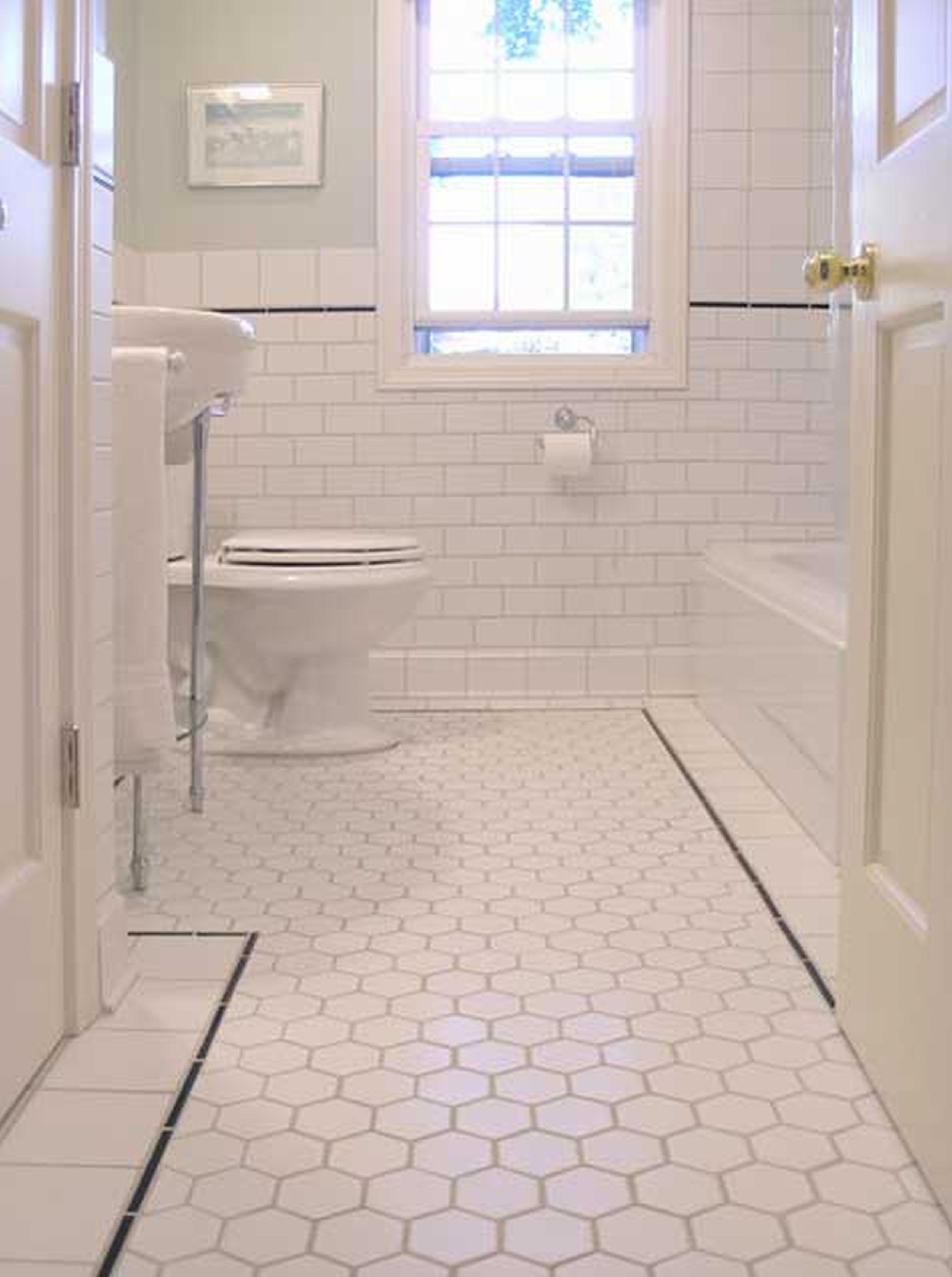
Defining Spaces Border tiles are excellent for defining different areas in the bathroom. I used them to outline the shower area and create a visual separation from the rest of the room. This subtle definition made the space look more organized and aesthetically pleasing.
Enhancing Architectural Features Trim tiles were perfect for highlighting architectural features. I used them to frame the niches in the shower and around the vanity mirror. This framing added depth and drew attention to these functional yet beautiful elements.
Adding Texture and Detail The addition of border and trim tiles brought texture and detail to the walls. The metallic trim tiles added a sleek, reflective quality that contrasted nicely with the matte finish of the main tiles. This textural interplay made the design more dynamic and interesting.
Creating a Cohesive Look The border and trim tiles helped create a cohesive look throughout the bathroom. By repeating these elements in different areas, such as the base of the walls and around the shower, I achieved a harmonious design that flowed seamlessly from one part of the room to another.
Simple Installation Installing border and trim tiles was straightforward and didn’t require extensive renovation. This made it an affordable way to upgrade the bathroom without a complete overhaul. The results were impressive, proving that even small changes can have a big impact.
Geometric Patterns: Modern and Chic Accent Ideas
Incorporating geometric patterns into my bathroom design brought a modern, chic touch that I absolutely loved. These patterns added a unique and stylish element to the space. Here’s how I integrated geometric patterns to elevate my bathroom’s look.
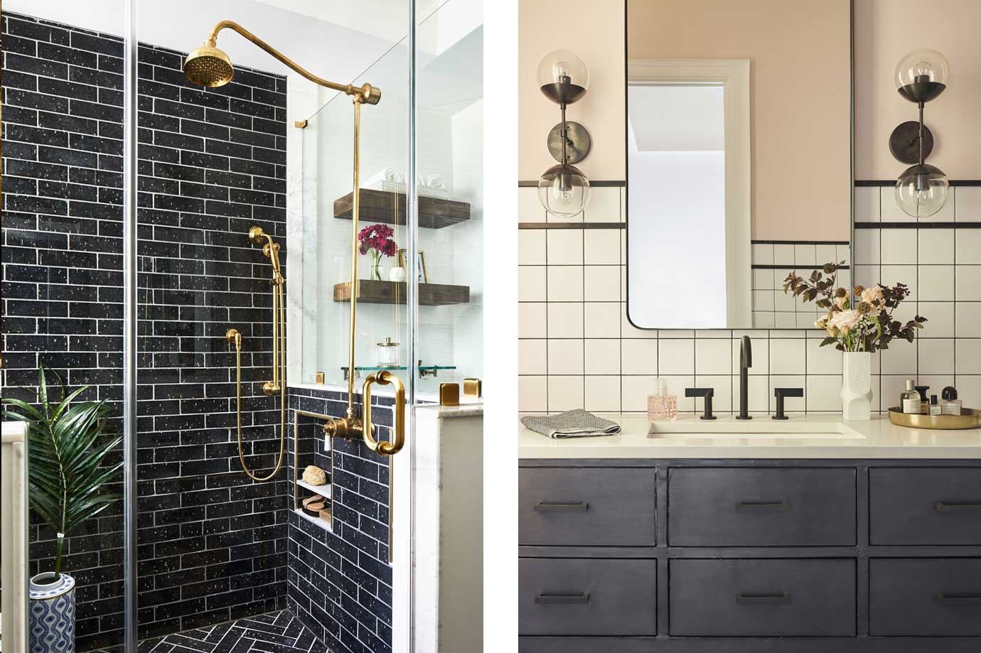
Choosing the Pattern I started by selecting a geometric pattern that suited my style. Hexagons, chevrons, and herringbone patterns were all appealing options. I ultimately chose a bold hexagon pattern for the floor tiles, which added a contemporary edge to the bathroom.
Color Coordination The color scheme was crucial for making the geometric pattern stand out. I chose a monochromatic palette with shades of gray and white. This created a striking yet sophisticated look that made the pattern the focal point without overwhelming the space.
Mixing and Matching To keep things interesting, I mixed and matched different geometric patterns. The hexagon tiles on the floor were complemented by a subtle chevron pattern on the shower wall. This combination added depth and visual interest while maintaining a cohesive design.
Strategic Placement Placement of the geometric patterns was key to achieving the desired effect. I used the bold hexagon tiles on the floor to anchor the design and create a statement. The chevron pattern in the shower added a stylish touch without competing with the floor.
Accents and Accessories To tie the look together, I incorporated geometric accents and accessories. A hexagon-shaped mirror, geometric-patterned towels, and minimalist light fixtures enhanced the modern vibe. These small touches echoed the main patterns and created a unified look.
Balancing with Simplicity While the geometric patterns were a focal point, I balanced them with simpler elements. Plain white walls and understated fixtures ensured the patterns stood out without making the space feel cluttered. This balance between bold and simple elements was key to the design’s success.
Mosaic Masterpieces: Creative Designs for a Unique Touch
Creating a mosaic masterpiece was one of the most enjoyable parts of my bathroom renovation. Mosaic tiles allowed me to get creative and design a unique, personalized space. Here’s how I used mosaic tiles to add a distinctive touch to my bathroom.
Choosing the Mosaic The first step was selecting the right mosaic tiles. I was drawn to a blend of glass and stone tiles in shades of blue and green. This combination created a beautiful, shimmering effect that reminded me of the ocean. The mix of materials and colors added depth and texture.
Design Planning Planning the design was crucial to achieving the desired effect. I decided to create a mosaic feature wall in the shower. Sketching out the design and mapping it onto the wall helped ensure that the pattern would be balanced and visually appealing.
Creating a Focal Point The mosaic feature wall became the focal point of the bathroom. The intricate pattern drew the eye and added a sense of artistry to the space. By keeping the rest of the design simple, the mosaic stood out as the star of the room.
Installation Technique Installing mosaic tiles required patience and precision. I used mesh-backed sheets of mosaic tiles, which made the installation process easier. Carefully aligning the sheets and using a level ensured that the pattern remained consistent and smooth.
Accentuating with Lighting Proper lighting was essential to highlight the mosaic tiles. I installed LED lights above the feature wall, which accentuated the tiles’ reflective qualities and made the colors pop. This lighting choice enhanced the overall effect and made the mosaic truly shine.
Finishing Touches To complete the look, I added complementary accessories and decor. Sea-inspired elements, like shells and driftwood, echoed the mosaic’s oceanic theme. Soft, fluffy towels in matching colors added a cozy touch and tied the whole design together.
Accent Tiles in the Shower: Enhancing Your Daily Routine
Using accent tiles in the shower was a fantastic way to enhance my daily routine and elevate the bathroom’s design. These tiles added visual interest and a touch of luxury to the space. Here’s how I incorporated accent tiles into my shower.
Choosing the Accent Tiles I started by selecting accent tiles that complemented the main tiles in the shower. I opted for glass tiles in a soothing aqua hue. These tiles added a splash of color and a touch of elegance, making the shower feel like a spa retreat.
Highlighting Key Areas Strategic placement of the accent tiles was key. I used them to highlight key areas, such as the niche and the back wall of the shower. This created a focal point and added depth to the design. The niche, with its beautifully tiled back, became a stylish and functional feature.
Creating Patterns To add visual interest, I arranged the accent tiles in a vertical stripe pattern on the back wall. This pattern drew the eye upward, making the shower appear taller and more spacious. The vertical stripes also added a modern, sophisticated touch.
Mixing Materials Mixing different materials added texture and depth. I combined the glass accent tiles with matte porcelain tiles for the main walls. The contrast between the glossy and matte finishes created a dynamic, layered look that was both elegant and visually engaging.
Enhancing with Lighting Proper lighting was essential to showcase the accent tiles. I installed a waterproof LED light strip along the top edge of the shower wall. This lighting choice highlighted the shimmering glass tiles and created a warm, inviting ambiance, especially during evening showers.
Practical Benefits Beyond aesthetics, the accent tiles also had practical benefits. The glass tiles were easy to clean and resistant to mold and mildew, making them a low-maintenance choice. The tiled niche provided convenient storage for shower essentials, keeping the space tidy and organized.
Mixing and Matching: Combining Different Tiles for a Cohesive Look
Mixing and matching different tiles was a fun and creative way to design my bathroom. This approach allowed me to combine various textures, colors, and patterns for a cohesive yet dynamic look. Here’s how I successfully mixed and matched tiles in my bathroom.
Choosing a Color Palette The first step was selecting a cohesive color palette. I chose a neutral base of whites and grays, accented with pops of blue. This palette provided a versatile foundation that allowed me to mix different tiles without clashing. The colors worked harmoniously, creating a balanced and inviting space.
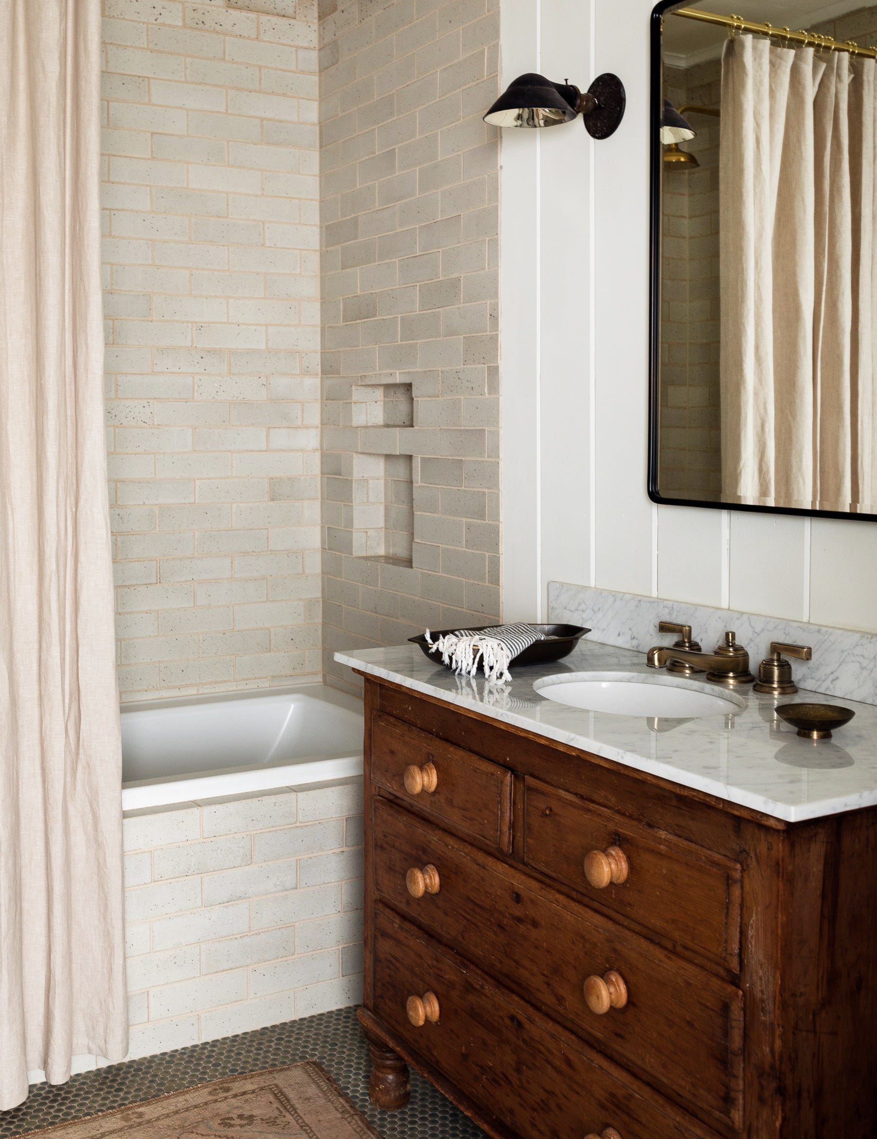
Selecting Complementary Tiles I selected tiles with complementary textures and finishes. Smooth, glossy subway tiles for the walls, textured stone tiles for the floor, and glass mosaic tiles for accents. Each tile brought a unique element to the design while still fitting within the overall aesthetic.
Creating Visual Interest Mixing different tile patterns added visual interest. I used a classic subway tile pattern for the walls, a herringbone pattern for the floor, and a vertical stripe pattern for the accent tiles. This combination added depth and movement to the design, making the space feel dynamic and stylish.
Balancing Bold and Subtle Elements Balancing bold and subtle elements was key to achieving a cohesive look. The bold herringbone pattern on the floor was balanced by the simple subway tiles on the walls. The subtle blue accent tiles added a pop of color without overwhelming the design. This balance ensured the space felt cohesive and well-composed.
Considering Scale and Proportion The scale and proportion of the tiles were important factors. Large floor tiles created a sense of spaciousness, while smaller mosaic tiles added intricate detail. I ensured that the different tile sizes worked together to create a harmonious flow throughout the bathroom.
Finishing Touches Finishing touches like grout color and accessories tied the look together. I chose a light gray grout that complemented all the tiles and added a polished finish. Matching towels, decor, and fixtures in shades of gray and blue completed the design, reinforcing the cohesive look.
Travertine Accent Tiles – Ideas on Foter
Tile Accent Pieces – Ideas on Foter
Modern Bathroom Tile Ideas
Luxury Bathroom Tile Patterns You Will Love – Kowalske Kitchen
Bathroom Tile Ideas You Want to Steal
Bathroom Tile Ideas – The Tile Shop
Related Posts:
